


Lookback had entered its fifth year of business, and we had not prioritized any brand projects during that time in order to focus on product value. Once we took a moment to breathe and make space for such a project, we chose to partner with Focus Lab for a short brand refresh sprint that I spearheaded. Focus Lab consistently delivers some of the strongest modern brand output for companies seeking an exhaustive yet efficient process tailored to today’s digital landscape.
At Lookback, we already had an internal design team capable of executing many of the traditional brand changes ourselves. But we wanted to collaborate with experts who could help guide us toward a brand that represented who we had become: a mature and prominent player in the UX research space.
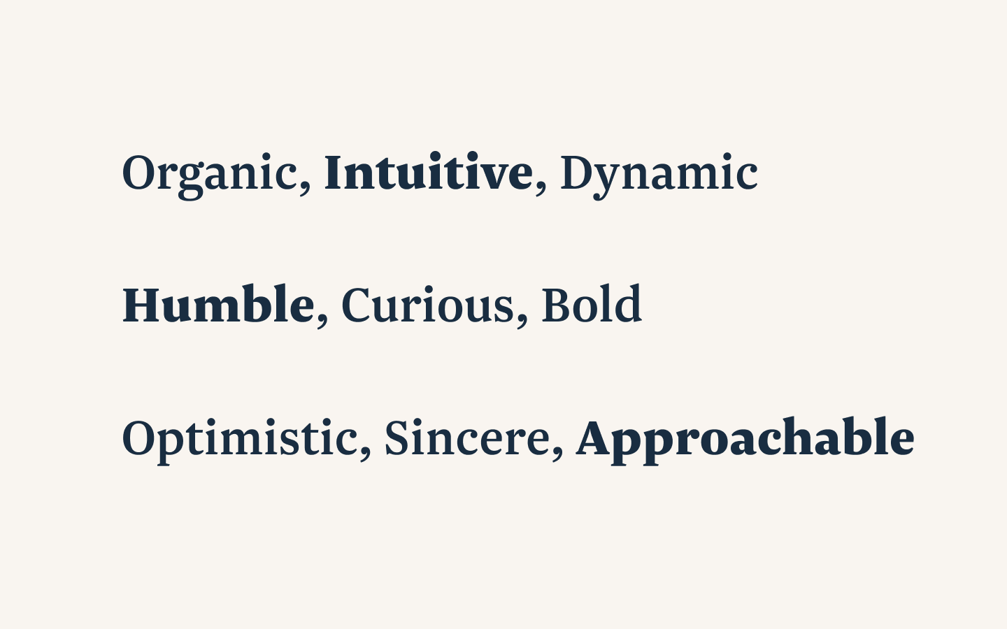
We have a diverse staff and an even more varied customer base. By this point, we were serving tens of thousands of customers around the world—and tens of millions of end users globally. We needed a brand that felt digital, yet organic and humane—one that reflected our thoughtfulness in design, product, and policy.
We had also grown beyond our early days as a simple (but powerful) digital utility that saved teams time. We were now a full platform, with deep workflows and multiple product offerings. Our brand needed to reflect this shift.
One of the internal insights that shaped the rebrand was this: our customers’ deepest desire when using Lookback is to discover insights from their users. And insights are interesting—they’re not just raw data, and they’re not just opinions. They’re an understanding of a specific cause and effect within a particular context. This distinction sits at the heart of our platform.
With the word “Insight” driving our creative direction, we worked with Focus Lab to develop a novel visual shape: the Insight Bulb. This mark represented the recognition of a moment worth revisiting—an opportunity for understanding and, potentially, action. It captured the essence of our customers’ curiosity and their drive to make products more intuitive and humane.
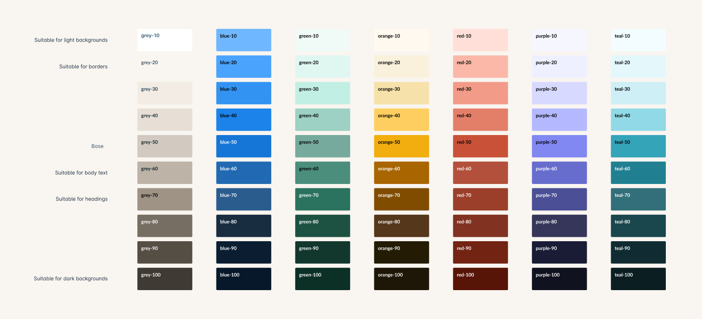
We took the foundational work from Focus Lab—logo, mark, and type explorations—and expanded it with our internal team. We created more accessible digital color palettes and UI component systems to serve our evolving product. We also extended the brand into physical spaces with merch and gifts that honored our new identity.
Huge thank-you to the team at Focus Lab and to my colleagues at Lookback who helped bring this work to life.